- Panyu District, Guangzhou, Guangdong, China
- 2044, 2nd Floor, Yayun Avenue, Dalong Street
- whatsapp:
- +86 13265357928
Beyond SPC Control Charts: Lesser-Known but Effective Quality Analysis Tools
When discussing quality anomaly analysis, almost everyone familiar with the field will mention SPC (Statistical Process Control) control charts. Indeed, SPC control charts are currently the most widely used tool for quality anomaly analysis (here, "widely used" refers to companies that already utilize quality analysis, though most manufacturing enterprises have not yet reached the stage of conducting quality anomaly analysis).
So, what other charts can we use for quality analysis related to SPC, besides the SPC control charts?
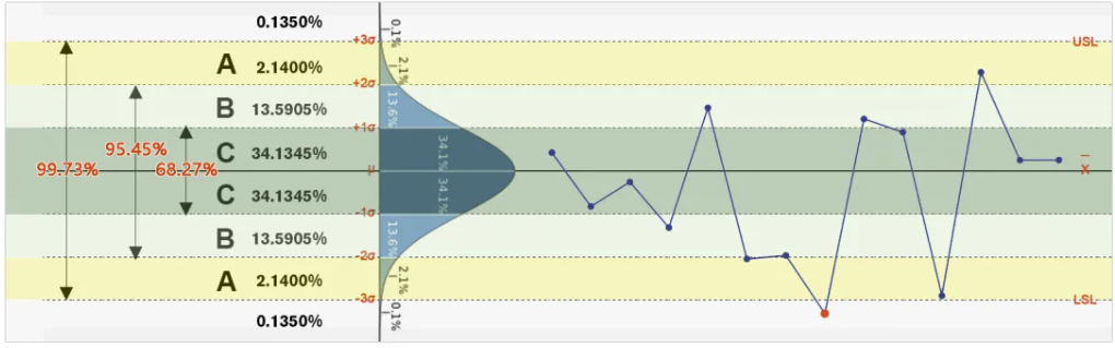
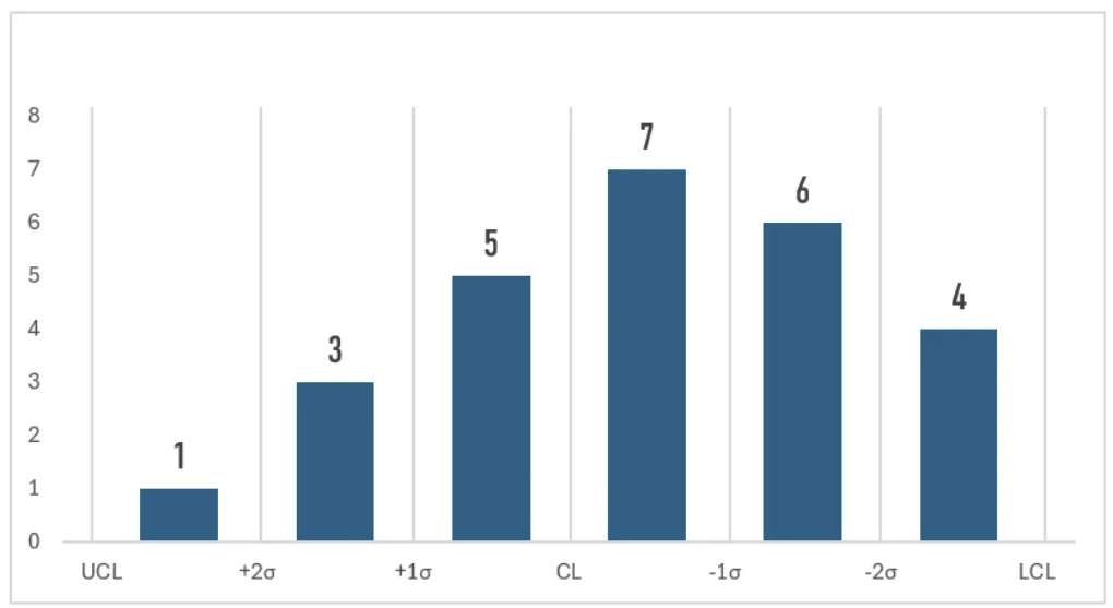
3σ Distribution Chart (My own coined term)
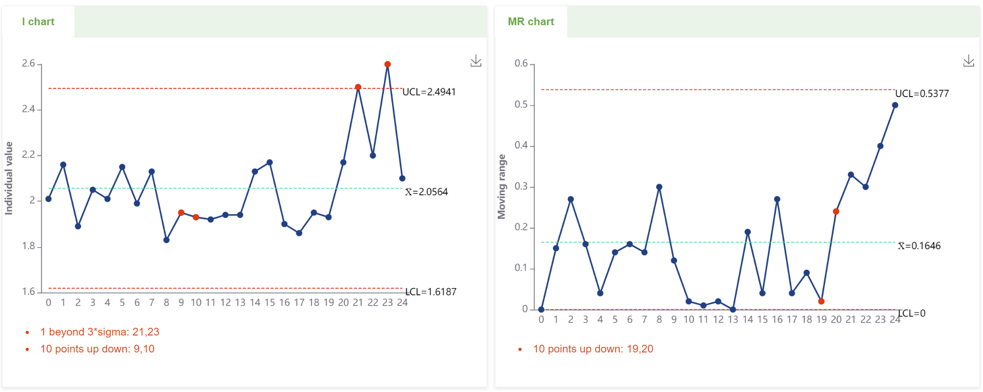
The chart below illustrates a 6sigma diagram; actual data rarely shows such an ideal state. When we look at control charts, they typically appear as shown below:
However, we often want to know the number or proportion of these points located in the upper and lower ABC zones. The horizontal axis divisions of a normal distribution histogram are often automatically generated, and not necessarily corresponding to each sigma. The following chart divides the upper and lower ABC zones into intervals for each sigma.
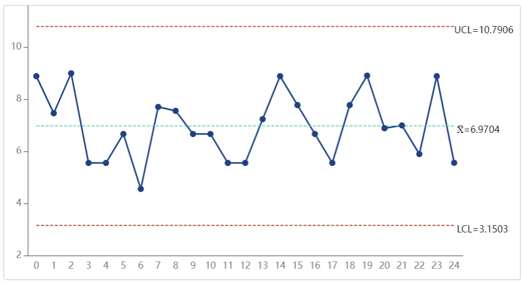
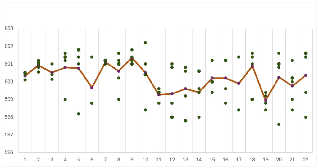
Variable Subgroup Control Chart (Another coined term)
Often, the number of samples in each batch is not fixed (not sampled by a fixed subgroup size). For the obtained data, we use the average to plot the chart and display each batch's data points on the chart to intuitively observe the distribution of the points.
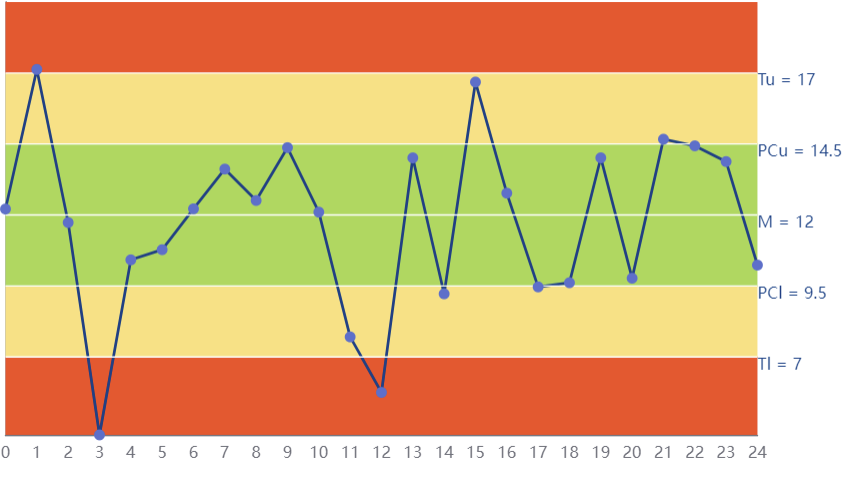
Rainbow Chart (Pre-control Chart)
The pre-control chart is a newer, simpler, more user-friendly, and more economical quality control technique. Compared to traditional Shewhart control charts, it is statistically more powerful, allowing quicker identification and response to anomalies by setting predefined limits. It is suitable for real-time production line monitoring and small batch production environments.
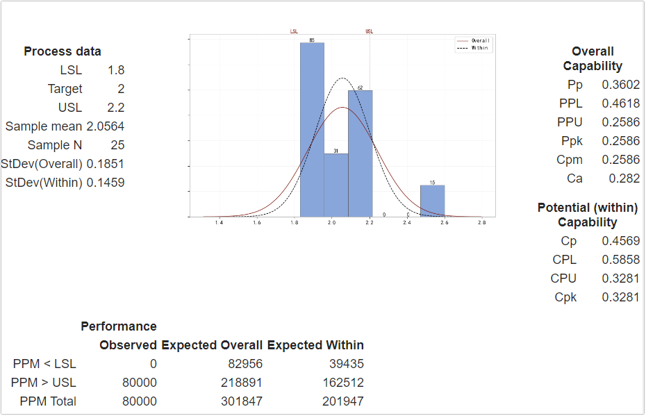
Capability Analysis Chart
The capability analysis chart is a comprehensive tool for process capability analysis. It includes a data distribution chart, overall and within-group distribution fitting curves, and indicators such as PPK, CPK, and Ca. These charts and indicators help us evaluate process performance and capability comprehensively, identify potential issues, and provide a basis for process improvement. Through these analyses, we can better understand process stability and consistency, thus more effectively controlling quality.
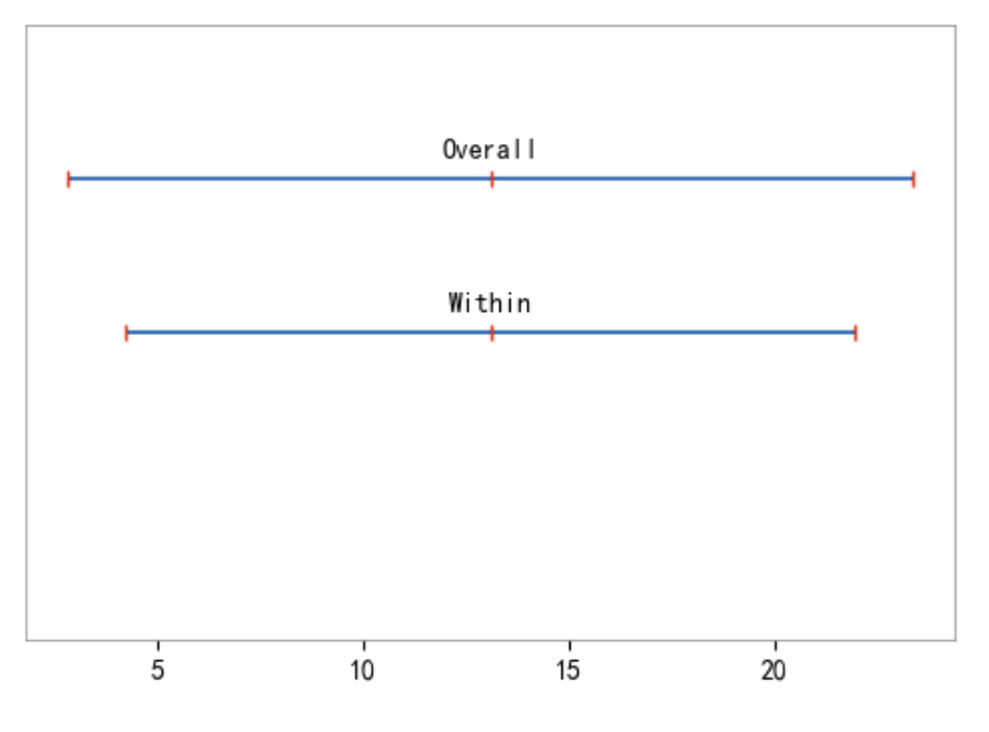
Capability Comparison Chart
The capability comparison chart visually compares specification limits, within-group actual deviation (range), and overall actual deviation (range). It allows us to see:
- Whether the data is within the specified range.
- The variation within subgroups.
- The overall data variation.
This chart helps identify issues within the process, such as if within-group deviation is much smaller than the overall deviation, it may indicate significant differences between batches. Conversely, if within-group and overall deviations are close, it indicates a more consistent and stable process.
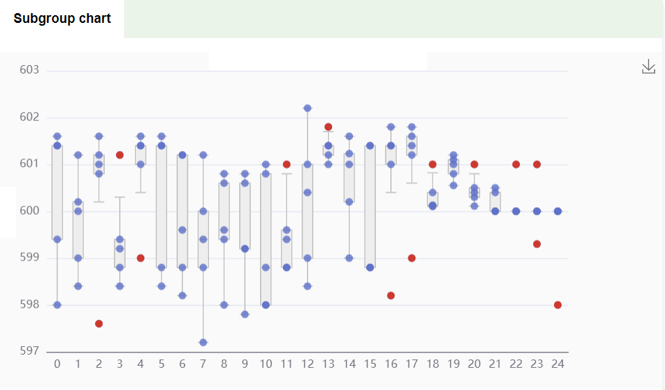
Subgroup Distribution Chart
This chart shows the distribution of measurement values for each subgroup. Each subgroup's measurement data is represented by a box plot. The box plot displays the median, interquartile range, and potential outliers for each subgroup. Red dots indicate outliers within each subgroup, significantly deviating from other data points, suggesting further attention and analysis may be needed.
This chart helps us intuitively understand the central tendency and dispersion of each subgroup's data, identify potential outliers, and thus better conduct quality control and data analysis.
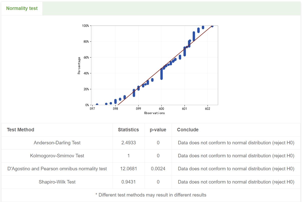
Normality Test Chart
The normality test chart is a tool used to assess whether data follows a normal distribution. By plotting data points on a specific chart, such as a Q-Q plot (Quantile-Quantile Plot) or a P-P plot (Probability-Probability Plot), it compares the actual data distribution to the theoretical normal distribution. If the data points roughly follow a straight line, the data conforms to a normal distribution; significant deviations indicate that the data may not follow a normal distribution. This chart is intuitive and easy to interpret, commonly used in statistical analysis.
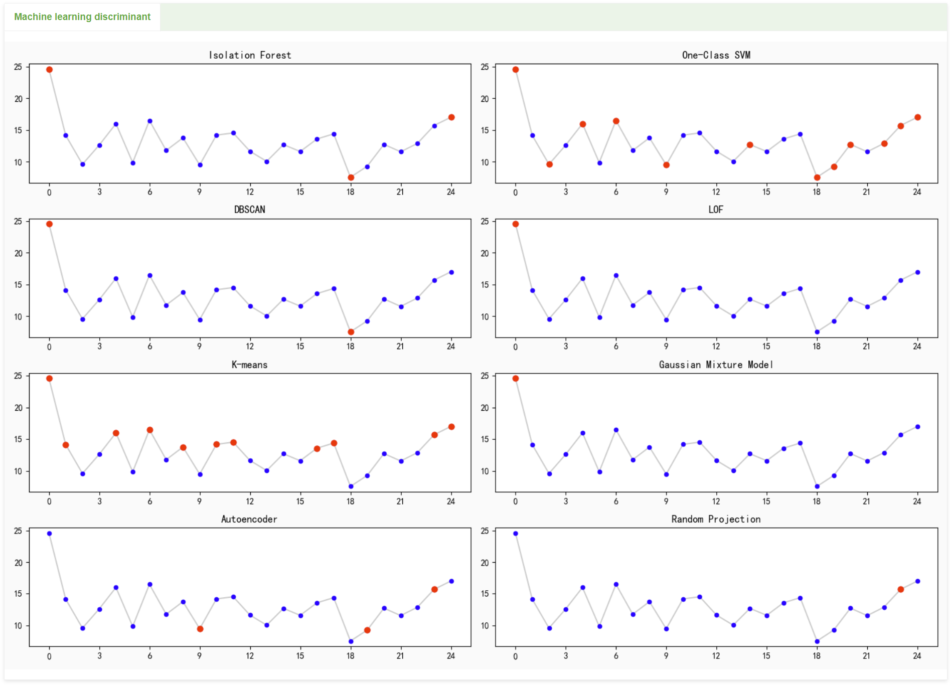
Machine Learning Anomaly Detection Chart
Machine learning for anomaly detection involves classifying data into two categories using regression-based binary classification methods, where the less frequent category is deemed anomalous. Algorithms such as linear regression, support vector machines (SVM), random forests, and K-means can be used.
However, machine learning for anomaly detection has a critical weakness: the judgment process is often a black box, making it difficult to understand. Unlike SPC's standard eight anomaly detection rules, we cannot clearly know why the machine learning algorithm determines a point as anomalous, making it challenging to find the underlying cause.
Among the analysis charts and tools mentioned above, there are always some that suit your needs.
- An In-Depth Analysis of SPC Abnormality Detection Logic
- What types of charts can be used in dashboards for subgroup-based inspection items?
- What creative uses can be made for dashboards containing single-value test data?
- What If Subgroup Sizes Are Not Fixed?
- Invisible Variations That Define Yield :Practical Applications of SPC in Semiconductor Manufacturing
- Simple SPC 4.0 – Detailed Product Overview
- Simple SPC 4.0 Official Release
- Using data to safeguard safety: Application practices of SPC in the pharmaceutical industry
- How can risks be identified in advance in automobile manufacturing? — Sharing SPC application practices
- Innovative Practices and Applications of Web SPC Systems
- Should Manufacturing Companies Still Implement SPC Amid Economic Downturn and Poor Business Performance?
- What should we do if the customer requires the immediate implementation of SPC process control during a factory audit?
- Simple SPC has been recognized for the third time as the "2025 SPC Statistical Process Control Software of the Year" by China SoftWare Home.
- Giving SPC AI Wings: DeepSeek Enhancing Efficiency and Depth of Quality Management
- AI-Enhanced Statistical Process Control (AI-SPC): Revolutionizing Quality Management in the Era of Smart Manufacturing
- General-Purpose Artificial Intelligence Models (DeepSeek, etc.) and Statistical Process Control (SPC): A New Era of Intelligent Quality Management
- Simple SPC 2.0 released, with upgraded functions and optimized performance
- CPK and PPK: Essential Questions in Quality Interviews, Do You Truly Understand Them?
- Unilateral or Bilateral: An In-Depth Exploration of Specification Limits and Control Limits in SPC Analysis and Their Impact on Metrics
- How to Calculate Control Limits for Xbar-R and Xbar-S Control Charts in SPC Analysis and When to Use Each Chart
- Is SPC or Another Method Better for Determining Batch Consistency with Standards? A Recommended Analysis Approach
- SPC is the most accessible, effective, and performance-demonstrating analytical tool in the manufacturing industry.
- How to Quickly Identify Hidden Correlations Between Test Items Using the SPC System?