- Panyu District, Guangzhou, Guangdong, China
- 2044, 2nd Floor, Yayun Avenue, Dalong Street
- whatsapp:
- +86 13265357928
SPC Blog
An In-Depth Analysis of SPC Abnormality Detection Logic
In SPC, Control Charts Are More Than Recorders — They Are Early Warning Systems for Process Stability
In Statistical Process Control (SPC), control charts are not merely tools for recording data; they serve as early warning systems for process stability.
The accuracy and flexibility of abnormality detection directly determine the effectiveness of a quality prevention system.
In Bingo’s self-developed Web-based SPC system, we integrate rigorous statistical theory with real industrial requirements, building a multi-dimensional and dynamic abnormality detection framework that enables earlier, more reliable quality risk identification.
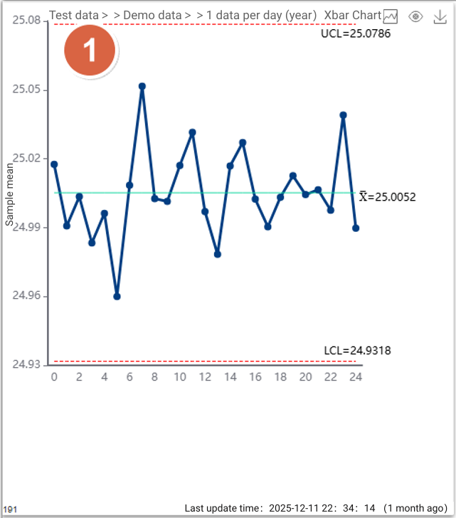
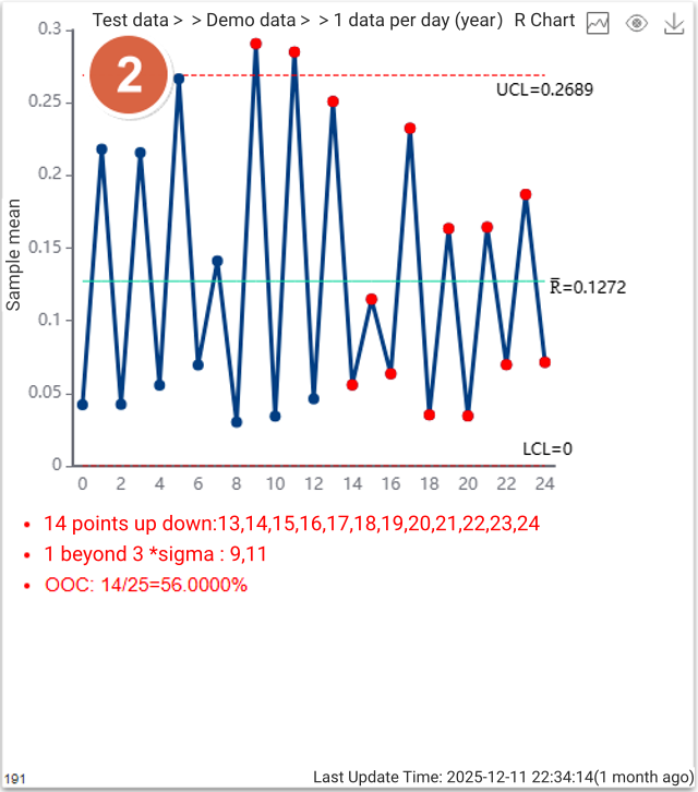
1. Statistical Foundation: Capturing Extremely Low-Probability Events
At its core, abnormality detection is about identifying low-probability events within process data.
Under a normal distribution, the probability of a data point exceeding ±3σ (three standard deviations) is only 0.3%.
Bingo SPC fully supports the standard Nelson Rules and further extends them to 11 abnormality detection rules, covering all typical patterns—from single-point violations to non-random trends.
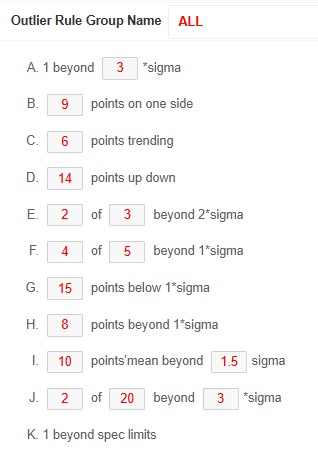
Common rules include:
Point beyond limits: One point beyond ±3σ from the center line
Shift: Nine consecutive points on the same side of the center line
Trend: Six consecutive points continuously increasing or decreasing
Alternation: Fourteen consecutive points alternating up and down
Zone rule: Two of three consecutive points beyond ±2σ on the same side
Customizable Rule Parameters
For each rule, parameters such as the number of consecutive points or sigma thresholds can be fully customized.
This flexibility allows the system to adapt to stricter or more relaxed business requirements, instead of forcing all processes to follow a single rigid standard.
2. Flexible Configuration: Three-Level Rule Group Priority Logic
Different industries—and even different processes within the same factory—have very different sensitivities to variation.
To solve the problem that “one-size-fits-all rules do not work,” the system introduces rule groups with hierarchical priority control:
System-level rules
Define the company-wide quality baseline.User-level rules
Support the analytical preferences of individual quality engineers.Inspection-item-level rules (highest priority)
Customized detection strategies for specific critical characteristics, such as key hole diameters or thickness.
This design ensures standardized quality control at the corporate level, while remaining flexible enough for highly differentiated scenarios such as chip substrate dimensions or equipment operating temperature.
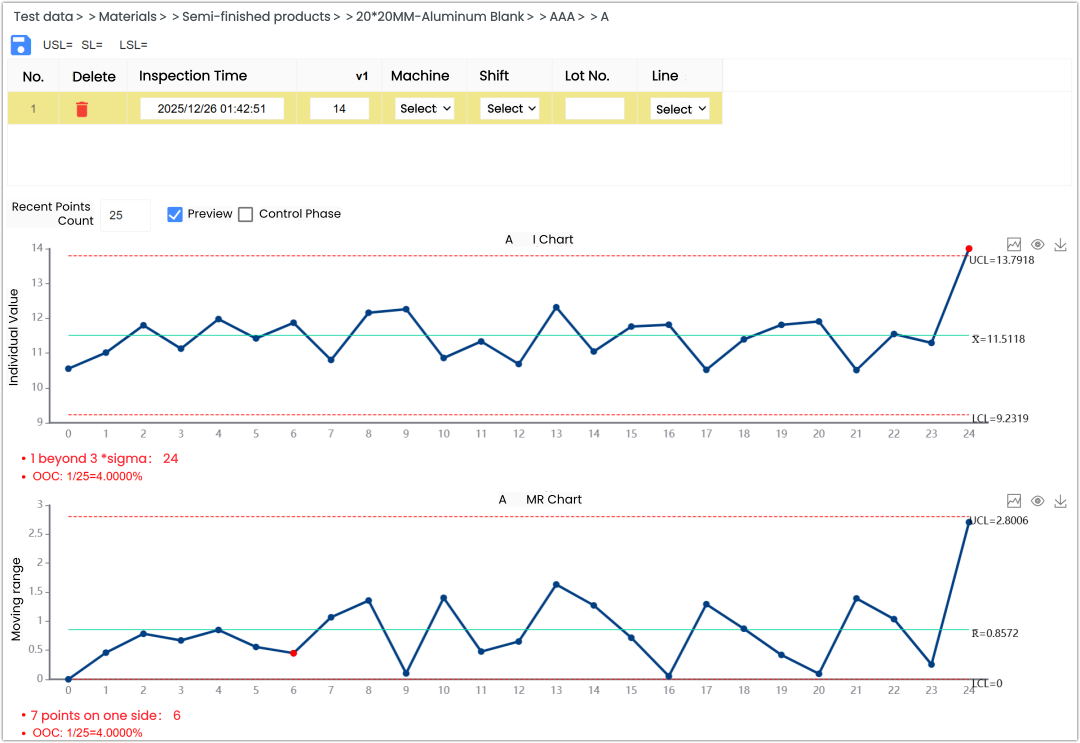
3. Real-Time Response: From Data Entry to Instant Highlighting
Abnormality detection is no longer an after-the-fact activity.
Once inspection data flows into the system—via manual entry, Excel upload, or real-time industrial protocols (TCP, MQTT, OPC, Web API, CSV)—the control chart updates dynamically without page refresh and highlights abnormal points instantly in red.
This “detect-as-you-measure” mechanism significantly shortens the time window between variation detection and corrective action, reducing the risk of defect propagation.
4. Evolution: Machine Learning and AI-Powered Interpretation
Beyond traditional statistical rules, Bingo SPC incorporates advanced technologies to enhance abnormality detection:
- Machine learning–based detection
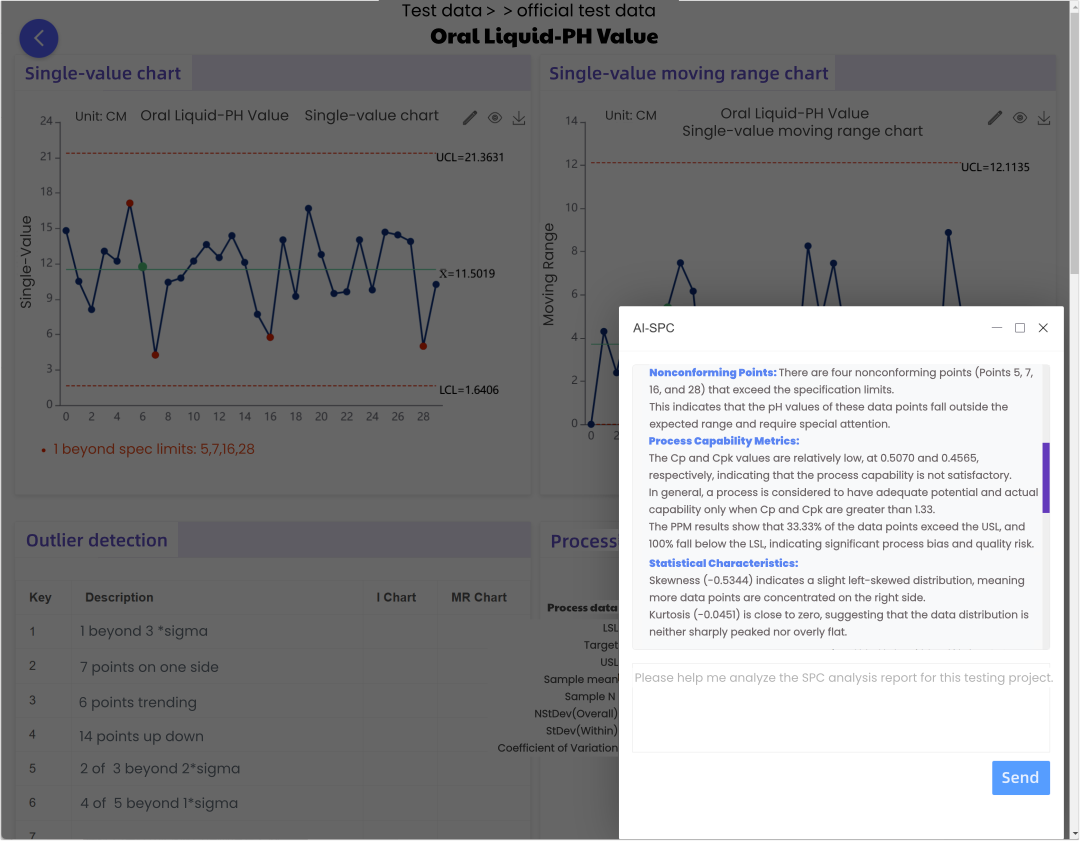
Algorithms such as Isolation Forest and K-Means are integrated as supplements to classical SPC rules, providing higher sensitivity when analyzing complex, multi-dimensional data. - AI large-model interpretation
By integrating models such as ChatGPT and DeepSeek, the system can generate intelligent explanations immediately after an abnormality is detected.
With one click, quality engineers receive AI-assisted insights to quickly identify whether the issue originates from Man, Machine, Material, Method, Measurement, or Environment.
Abnormality detection rules are the core of any SPC system.
By combining standardization, customization, and intelligent interpretation, Bingo SPC enables every quality curve to “speak”—issuing warnings before defects are produced, not after.
This is how SPC moves from passive monitoring to proactive quality prevention.
What types of charts can be used in dashboards for subgroup-based inspection items?
In SPC analysis, many inspection datasets are collected in subgroups.
For this type of data, how should SPC dashboards be designed for a single inspection item?
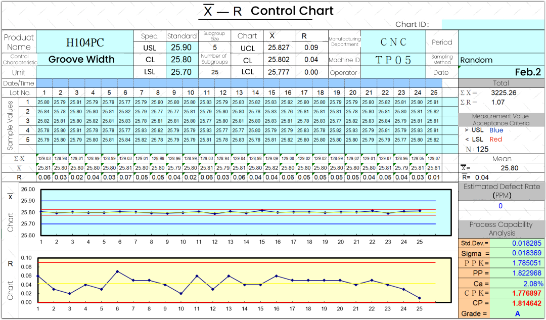
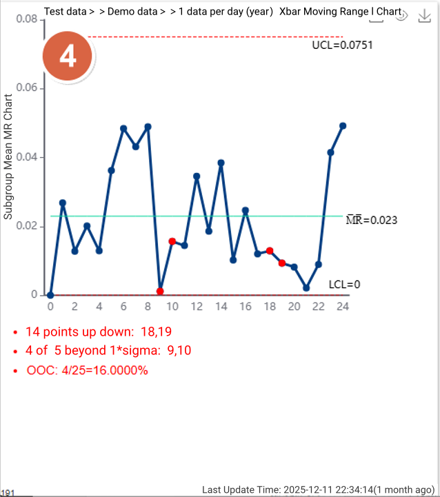
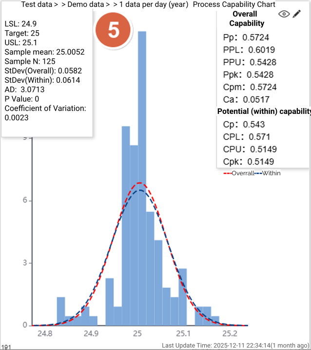
For subgroup-based inspection items, we provide six standard SPC dashboard charts.
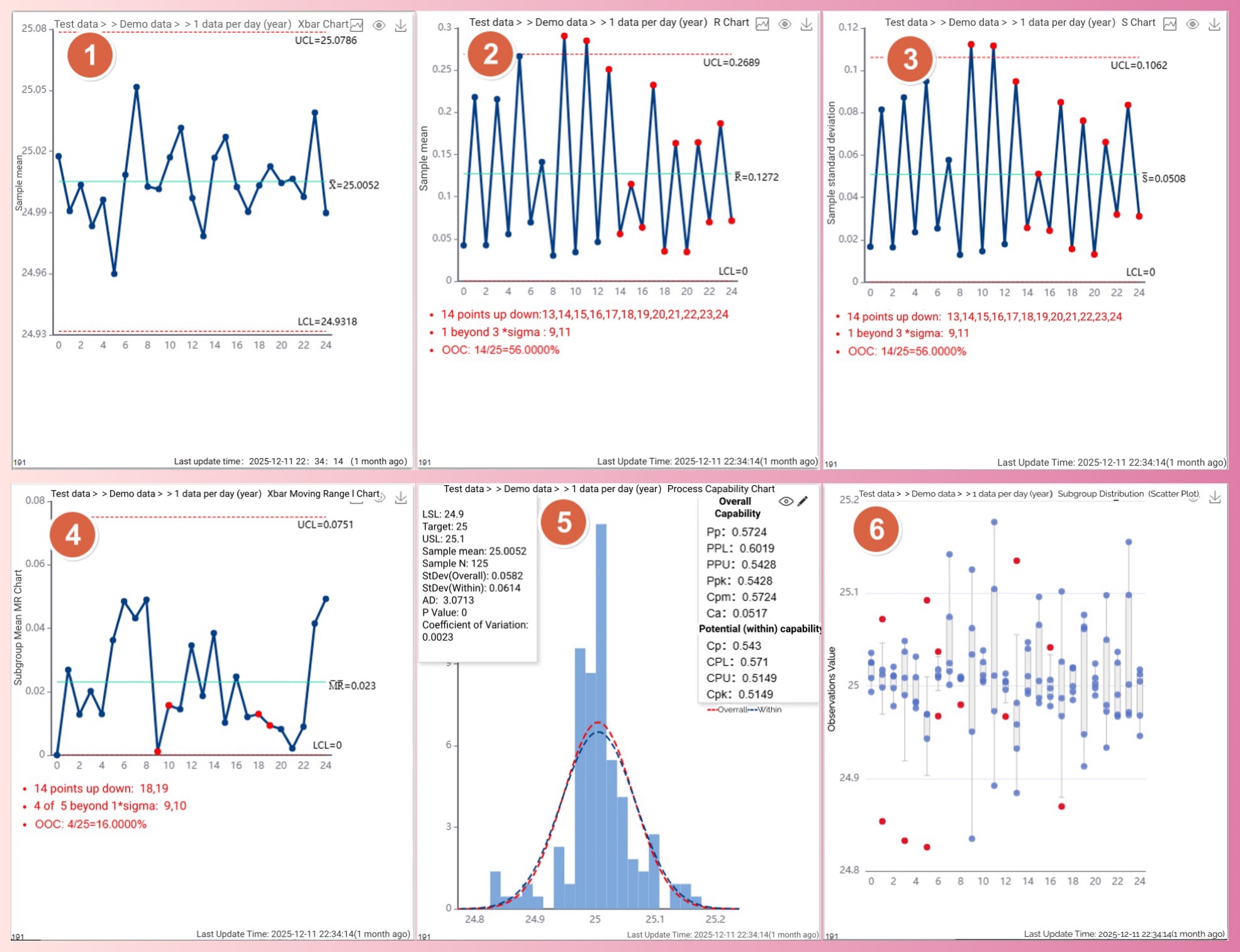
P1:Xbar Control Chart
P2:R Control Chart
P3:S Control Chart
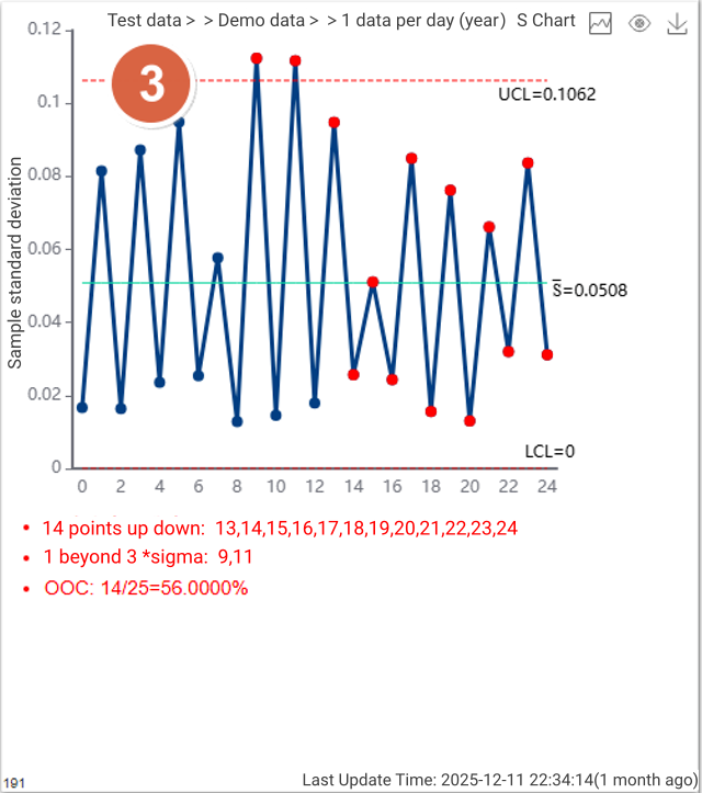
P4:Xbar Moving Range Control Chart
P5:Process Capability Chart
P6:Subgroup Distribution Chart (Scatter Plot)
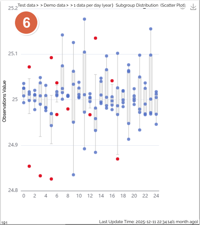
In the SPC dashboard shown above:
You can display multiple charts for the same inspection item, or
You can display different charts for different inspection items,
depending on your monitoring and analysis requirements.
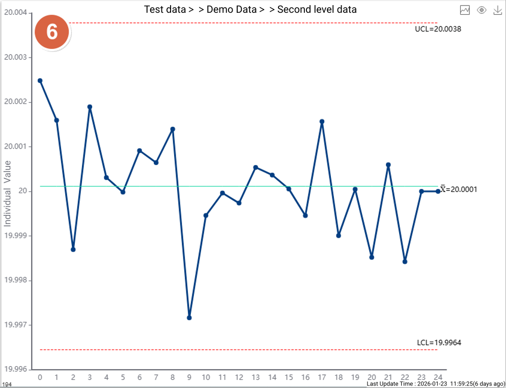
What creative uses can be made for dashboards containing single-value test data?
Data like the following is a one-dimensional dataset sorted by time, such as:
· A single batch of a testing item has only one value.
· A machine continuously collects a specific testing parameter.
like:
20.03,20.06,20.03,20.01,20.01,19.98,19.99,20.03,19.96,19.99,19.98,19.98,19.99,20,19.99,20,20.02,19.97,20,19.94,20.01,20.01,
19.98,20.02,19.98
We will create the following single-value six-control chart dashboard for this single testing item:
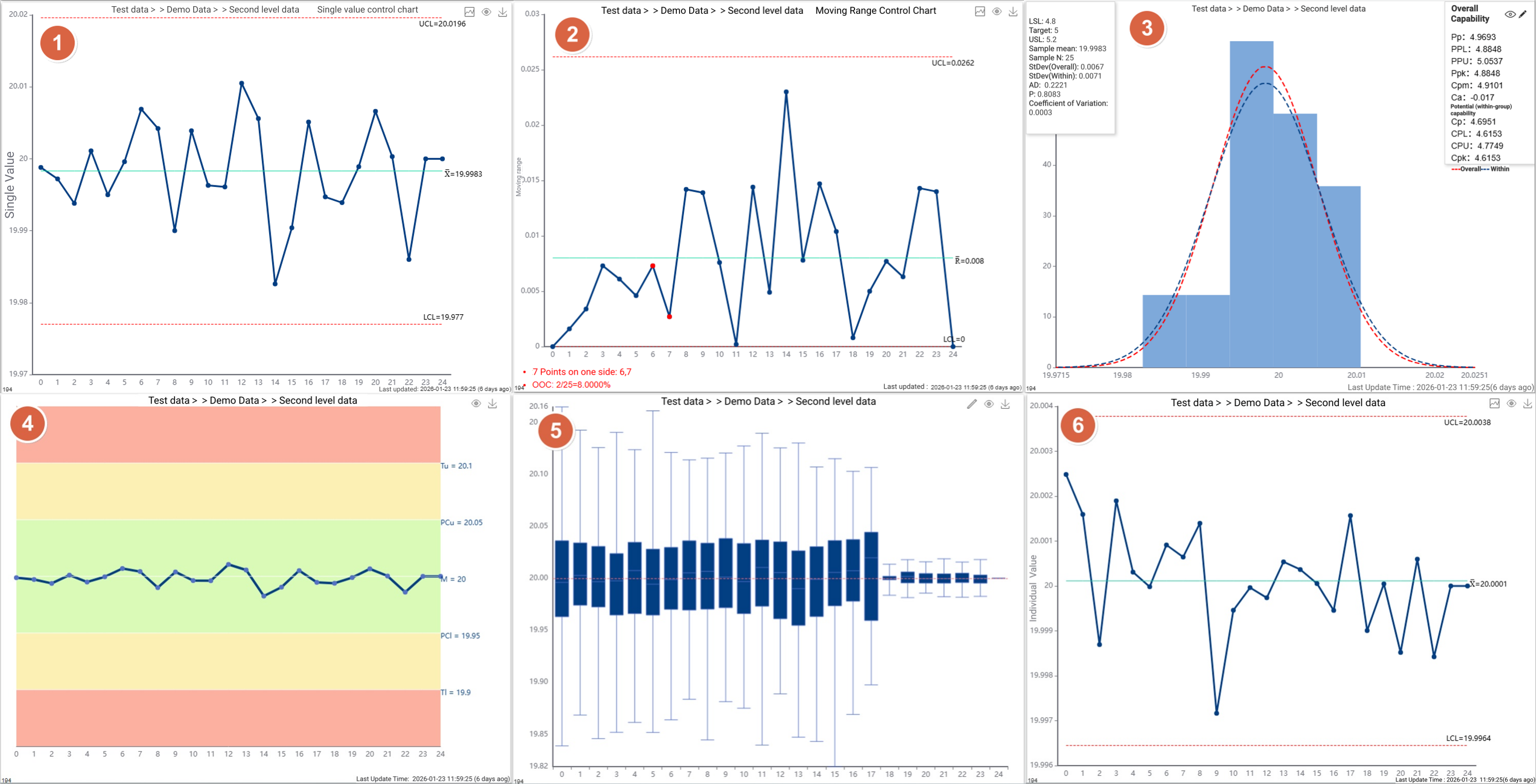
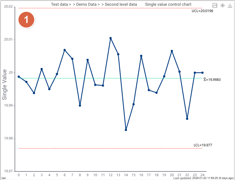
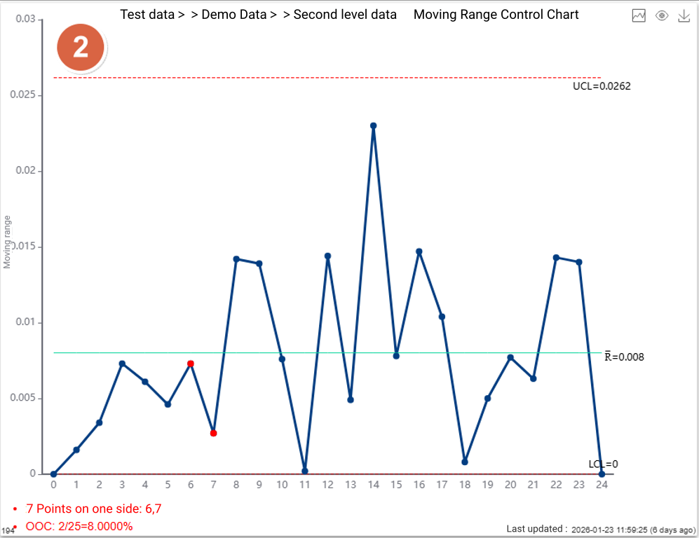
Figure 3: Process Capability Histogram
Figure 4: Rainbow Plot
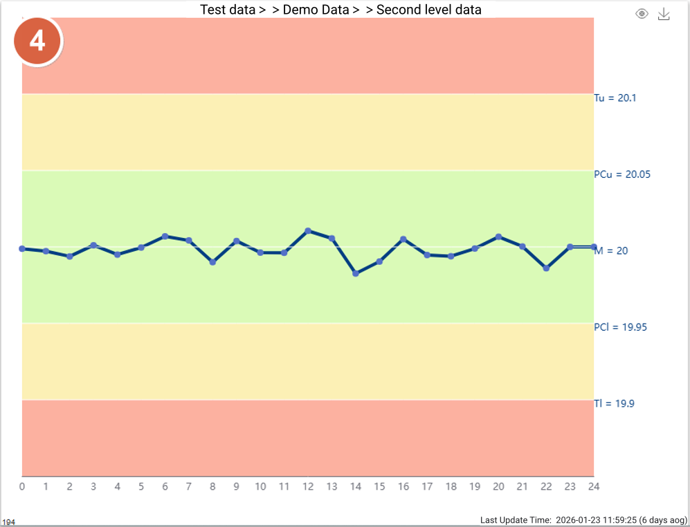
Figure 5: Box Plot (Grouped by minute, configurable)
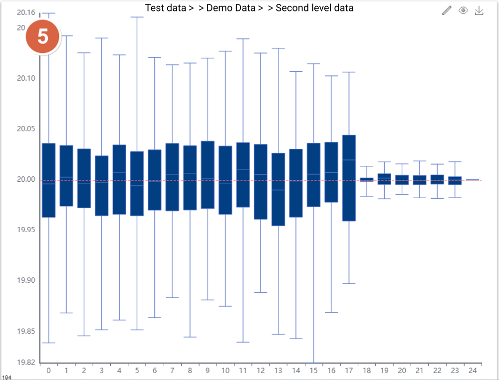
Figure 6: Sampling I Control Chart (Mean per minute used as single value for plotting, configurable)
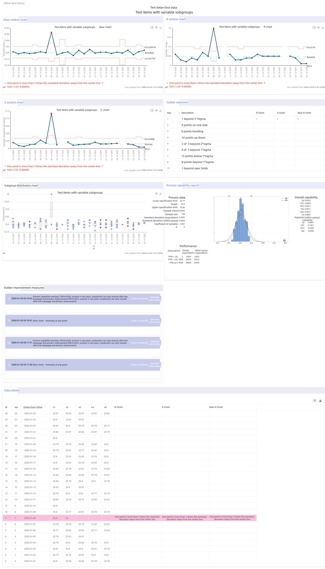
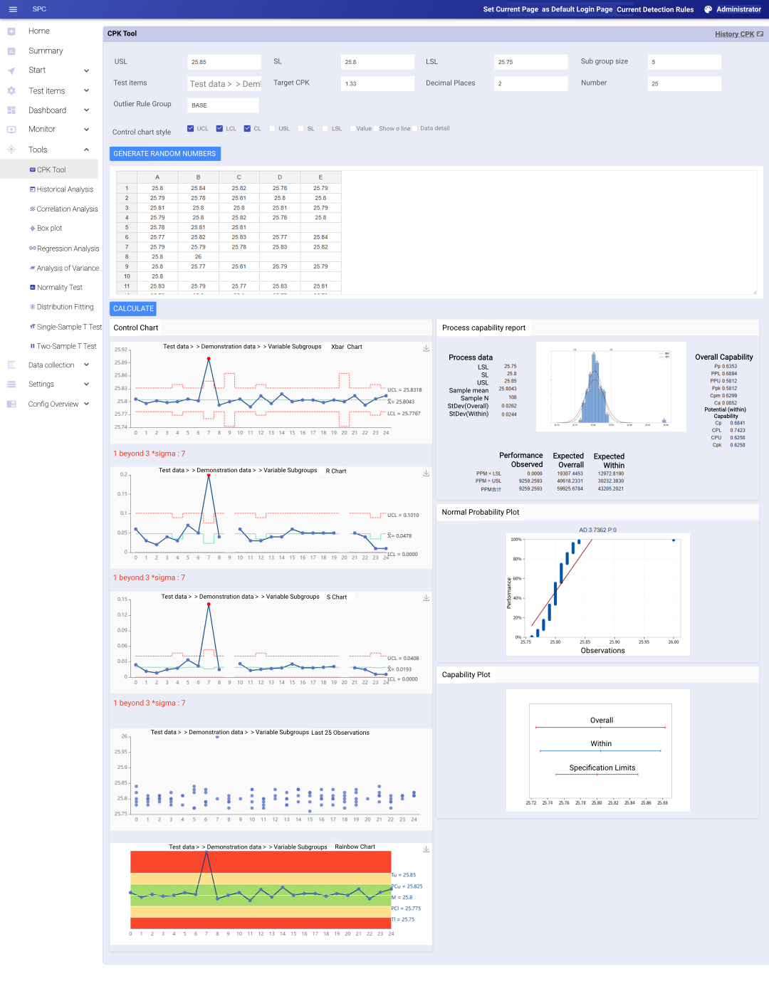
What If Subgroup Sizes Are Not Fixed?
In standard Statistical Process Control (SPC) textbooks, subgroup sizes are typically recommended to be fixed at 3–5 samples.
This recommendation is based on an ideal assumption: each production batch or time interval yields the same number of samples.
However, in real manufacturing environments, this assumption often does not hold.
Due to factors such as end-of-batch material shortages, sample loss, or varying time windows in high-frequency automated data collection, subgroup sizes (n) frequently fluctuate.
Limitations of Traditional SPC Tools
When faced with variable subgroup sizes, traditional Excel templates or entry-level SPC software usually fail—either producing errors or requiring manual data splitting and padding.
Such workarounds not only distort the authenticity of the data, but also obscure the true sources and structure of process variation.
How Simple SPC Handles Variable Subgroup Sizes
Simple SPC provides full support for SPC analysis with non-fixed subgroup sizes using statistically sound and production-ready methods.
Stepwise Control Limit Algorithm
Accurately Capturing the True Voice of the Process
From a statistical standpoint, variations in subgroup size (n) directly affect the standard deviation of the subgroup mean.
For this reason, Simple SPC dynamically calculates the Upper and Lower Control Limits (UCL/LCL for each individual data point, based on the actual subgroup size of that point.
As a result, the control chart displays scientifically derived stepwise control limits, ensuring that out-of-control detection for every subgroup is statistically rigorous, consistent, and reliable, even when subgroup sizes fluctuate.
Full Control Chart Support for Variable Subgroups
For processes with fluctuating subgroup sizes, the system provides a complete set of statistical tools:
X-bar Chart
Monitors the process mean and central tendency.R Chart / S Chart
Monitors within-subgroup variation.
When subgroup sizes vary significantly, the system recommends using the Xbar-S chart, as it utilizes all sample information more accurately to estimate process variation.
Process Capability Analysis
CPK / PPK
- PPM
Distribution plots
Capability histograms
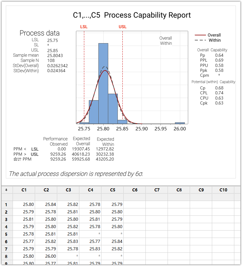
Example
The figure below shows an SPC analysis report for a process with variable subgroup sizes generated by Our SPC.
Using the same dataset, the results were recalculated using the Simple SPC CPK Tool for verification and comparison.
CPK Tool Support
The CPK Tool fully supports analysis based on variable subgroup sizes, ensuring consistency between SPC monitoring and capability evaluation.
Consistent with Minitab Results
Professional rigor is the bottom line for quality engineers.
To validate statistical accuracy, we input the same complex dataset with variable subgroup sizes into both Minitab and the Simple SPC 4.0 CPK Tool for parallel verification.
Validation Results
The results show that both systems produce completely identical outputs, including:
Control limits (UCL / LCL)
Mean values
Sigma estimates
Process capability indices (CPK, PPK)
This confirms that Simple SPC maintains industrial-grade statistical precision, while delivering a lightweight, fully digitalized experience through a browser-based (B/S) architecture with no client installation required.
Invisible Variations That Define Yield :Practical Applications of SPC in Semiconductor Manufacturing
·Process Control Methods for High Yield and Stable Volume Production:
1. What Is the Real Risk in Semiconductor Manufacturing?
In semiconductor manufacturing, the most dangerous issues are often not obvious out-of-spec events, but invisible and persistent process variations.
Wafer fabrication involves hundreds to thousands of tightly coupled process steps, each operating within extremely narrow process windows. Even a minor parameter shift can be amplified through downstream processes, eventually resulting in:
Yield degradation
Parameter distribution drift
Large-scale scrapping of high-value wafer lots
This reality determines that the semiconductor industry cannot rely on end-of-line inspection to ensure quality. Instead, it must continuously answer two critical questions during production:
Is the process stable?
Is the process still under control?
Statistical Process Control (SPC) exists precisely to address these questions and has become a foundational capability in modern semiconductor manufacturing.
2. The Role of SPC in the Semiconductor Industry
Unlike traditional manufacturing, SPC in semiconductor fabs is not merely a statistical tool used by quality departments. Instead, it serves as:
A daily monitoring method for process engineers
A key reference for equipment and process condition assessment
A critical input for yield management and production release decisions
In practice, SPC is typically integrated with MES/EAP/FDC/APC systems, forming a comprehensive process control framework that supports:
Early identification of process drift
Proactive exception handling in advance
Support process and equipment decisions
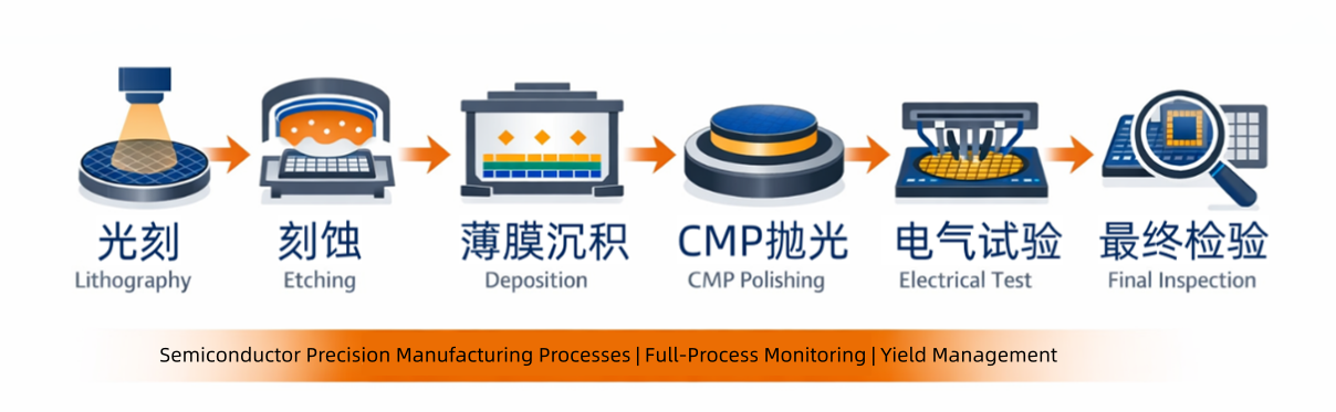
3. Typical SPC Application Scenarios in Semiconductor Manufacturing
3.1 Lithography: Core Control of Process Windows
Lithography is one of the most yield-critical steps in semiconductor manufacturing. SPC is commonly used to monitor:
Critical Dimension (CD)
Overlay
Dose
Focus
Given the extreme sensitivity of lithography parameters to yield, semiconductor fabs focus heavily on subtle trend shifts rather than obvious limit violations. Therefore, SPC applications often combine:
I-MR control charts
EWMA and CUSUM trend detection methods
to enable early detection of ”chronic loss of control“.
3.2 Etching: Ensuring Uniformity and Stability
In etching processes, SPC is primarily applied to monitor:
Etch depth
Line width variation
Within-wafer and wafer-to-wafer uniformity
Continuous SPC monitoring helps engineers identify:
Chamber condition changes
Consumable aging and contamination risks
Process parameter drift
thereby reducing the risk of batch-level excursions.
3.3 Thin Film Deposition (CVD / PVD / ALD): Consistency Management
Typical SPC monitoring parameters in deposition processes include:
Film thickness
Refractive index
Resistivity
Uniformity
SPC is used not only for single-tool stability control, but also widely applied in:
Tool matching across multiple equipment sets
Maintenance and cleaning interval optimization
3.4 CMP (Chemical Mechanical Planarization): Preventing Over-Polish and Under-Polish
CMP processes are characterized by high process noise and complex parameter coupling. SPC monitoring focuses on:
Removal rate (RR)
Surface roughness
Planarity metrics
By applying SPC, fabs can distinguish random variation from systematic drift, preventing long-term yield loss caused by cumulative deviations.
3.5 Electrical Testing and Yield Monitoring
In front-end manufacturing, SPC is applied not only to process parameters, but also extensively used for:
Monitoring key electrical characteristics
Analyzing yield trend indicators
This allows engineers to trace yield anomalies upstream to specific process steps, enabling faster root-cause identification.
4. Key Characteristics of SPC in Semiconductor Manufacturing
Compared to traditional manufacturing, semiconductor SPC exhibits distinct characteristics:
4.1 High Frequency, Small Samples, Large Data Volumes
Single-point or very small subgroup sampling
High-frequency monitoring
4.2 Complex Data Distributions
Non-normal distributions are common
Skewed and long-tailed characteristics frequently observed
As a result, practical SPC applications often require a combination of:
Data transformation methods
Trend-based control charts
Non-normal analysis strategies
4.3 Focus on Trends Rather Than Single-Point Violations
In semiconductor manufacturing, the most significant risks typically arise from:
Long-term, gradual, and continuous process drift
Therefore, the core value of SPC lies in early trend detection, rather than reacting only after parameters exceed control limits.
5. Core Value Delivered by SPC for Semiconductor Enterprises
Through systematic SPC implementation, semiconductor manufacturers can:
Detect process instability early and protect yield
Reduce the risk of scrapping high-value wafers
Support equipment maintenance and process optimization decisions
Improve consistency and stability across tools and production lines
In advanced process nodes, SPC has become a key reference for process release and stable mass production.

6. Conclusion: SPC as the “Invisible Defense Line” of Semiconductor Manufacturing
In the semiconductor industry:
Invisible variations are often the greatest risk.
SPC is not merely a set of statistical charts, but a comprehensive process control methodology designed to:
Continuously monitor process conditions
Detect abnormal trends at an early stage
Safeguard yield and stable volume production
Those who can identify process drift earlier are better positioned to protect yield—and maintain long-term competitiveness.
- An In-Depth Analysis of SPC Abnormality Detection Logic
- What types of charts can be used in dashboards for subgroup-based inspection items?
- What creative uses can be made for dashboards containing single-value test data?
- What If Subgroup Sizes Are Not Fixed?
- Invisible Variations That Define Yield :Practical Applications of SPC in Semiconductor Manufacturing
- Simple SPC 4.0 – Detailed Product Overview
- Simple SPC 4.0 Official Release
- Using data to safeguard safety: Application practices of SPC in the pharmaceutical industry
- How can risks be identified in advance in automobile manufacturing? — Sharing SPC application practices
- Innovative Practices and Applications of Web SPC Systems
- Should Manufacturing Companies Still Implement SPC Amid Economic Downturn and Poor Business Performance?
- What should we do if the customer requires the immediate implementation of SPC process control during a factory audit?
- Simple SPC has been recognized for the third time as the "2025 SPC Statistical Process Control Software of the Year" by China SoftWare Home.
- Giving SPC AI Wings: DeepSeek Enhancing Efficiency and Depth of Quality Management
- AI-Enhanced Statistical Process Control (AI-SPC): Revolutionizing Quality Management in the Era of Smart Manufacturing
- General-Purpose Artificial Intelligence Models (DeepSeek, etc.) and Statistical Process Control (SPC): A New Era of Intelligent Quality Management
- Simple SPC 2.0 released, with upgraded functions and optimized performance
- CPK and PPK: Essential Questions in Quality Interviews, Do You Truly Understand Them?
- Unilateral or Bilateral: An In-Depth Exploration of Specification Limits and Control Limits in SPC Analysis and Their Impact on Metrics
- How to Calculate Control Limits for Xbar-R and Xbar-S Control Charts in SPC Analysis and When to Use Each Chart
- Is SPC or Another Method Better for Determining Batch Consistency with Standards? A Recommended Analysis Approach
- Beyond SPC Control Charts: Lesser-Known but Effective Quality Analysis Tools
- SPC is the most accessible, effective, and performance-demonstrating analytical tool in the manufacturing industry.
- How to Quickly Identify Hidden Correlations Between Test Items Using the SPC System?