- Panyu District, Guangzhou, Guangdong, China
- 2044, 2nd Floor, Yayun Avenue, Dalong Street
- whatsapp:
- +86 13265357928
SPC Blog
Simple SPC 4.0 – Detailed Product Overview
Simple SPC is a privately deployed, browser-based Web SPC system designed for enterprise-level statistical process control.
No client installation is required—users can access the system directly through a standard web browser.
Simple SPC has been recognized for three consecutive years as a “Recommended SPC Software” by Ruanfujia (软服之家), a leading Chinese enterprise software evaluation platform.
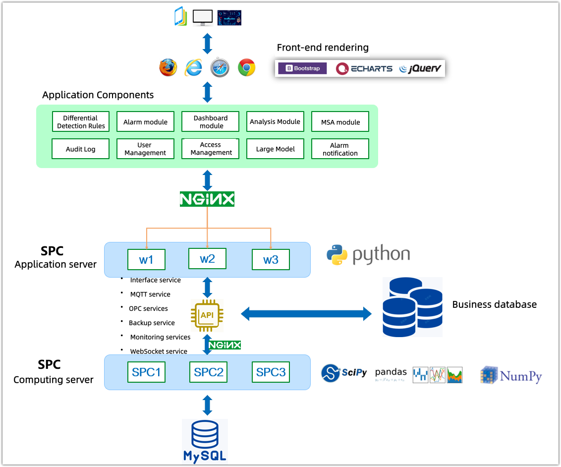
1. Web-Based Architecture
- Server licensing: One-time lifetime license, no annual licensing fees.
- Browser-based access, no local client installation required
- Unlimited user count, unlimited online users, unlimited points (features, detection items), unlimited dashboards.
- Supports SPC control charts:
- I–MR
- Xbar-S
- Xbar-R
- MR–R/S
- NP, C, P, U
- Supports 11 languages, Simple is the most language support globally, Including English, Simplified Chinese, Traditional Chinese, Spanish, Japanese, Korean, Vietnamese, Indonesian, Hindi, Thai, and Malay.
- All company employees can use it.
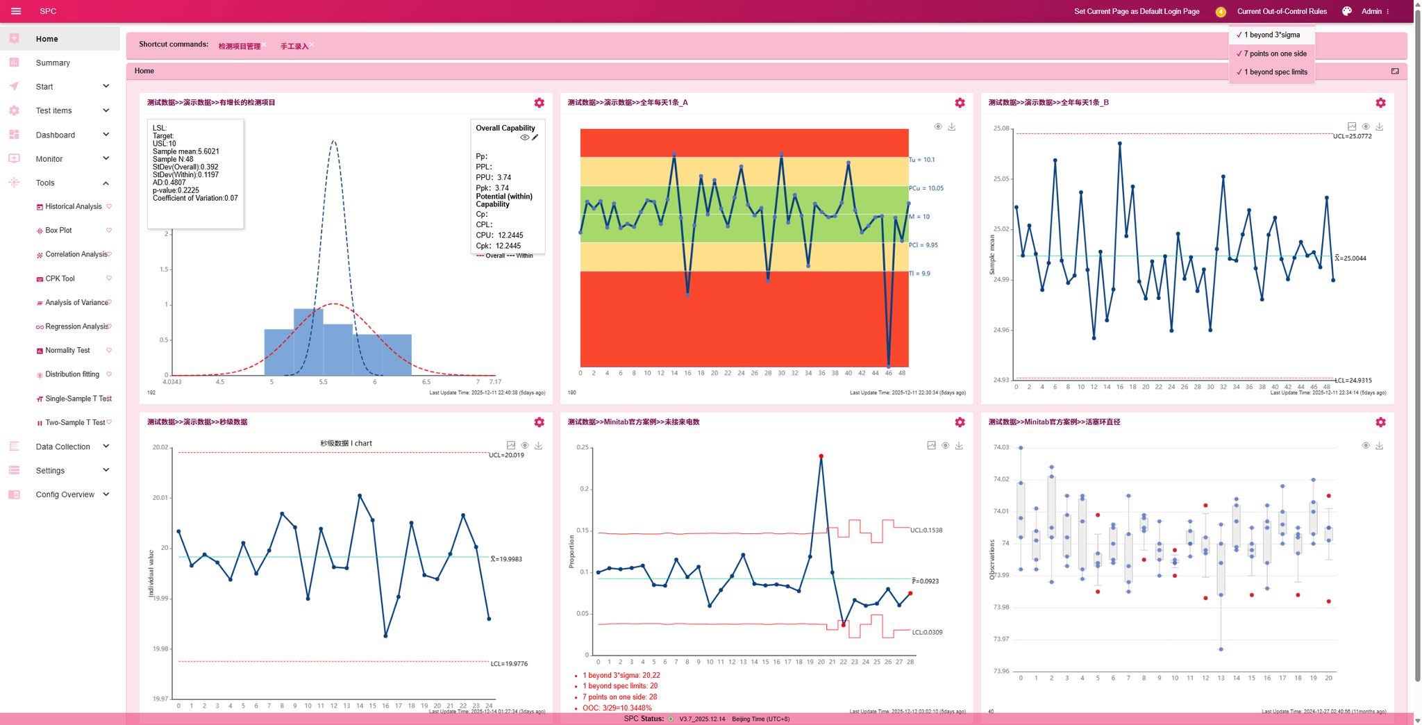
2. Rule-Based Out-of-Control Management
- Different inspection items can be assigned different SPC decision rules
- Supports 11 out-of-control rules, including the standard Western Electric 8 rules
- Rule parameters are fully configurable
- Rules can be grouped and centrally managed
- Rule groups can be bound to different inspection items, supporting complex manufacturing scenarios
3. Real-Time Dynamic SPC Charts
- SPC charts update automatically in real time
- No browser refresh required when new data arrives
4. Inspection Items & SPC Analysis
Once the quality data is fully and automatically collected, all the data is stored in our SPC system, each inspection item can generate a complete SPC analysis report with a single click, including:
- Appropriate control chart selection and subgroup distribution
- Process Capability Analysis Report:
- Cpk, Ppk, PPM
- Distribution charts and fitted curves
- Normal probability plots and capability comparison charts
- Normality tests and distribution fitting tests
- Machine-learning-based anomaly detection charts
- Statistical summary tables and capability tables
- Raw data details and rainbow charts
- Historical out-of-control events and corresponding improvement actions
Supported SPC Analysis Types
Individual data
- I–MR charts
Fixed subgroup
- Xbar charts
- R charts
- S charts
- MR–R/S charts
- Xbar moving range charts
Variable subgroup size
- Xbar charts
- R charts
- S charts
Attribute data
- NP charts
- C charts
- P charts
- U charts
Record-only items
- Descriptive inspection items (for traceability without SPC calculations)
5. SPC Dashboards
As manufacturing digitalization advances, dashboards are widely used on the shop floor to produce production status, such as order progress and workstation load.
Quality management follows the same visualization approach by:
- Deploy real-time SPC dashboards at any production station or line
- Monitor quality anomalies for specific workstations, lines, or orders
Dashboard Capabilities
- Unlimited number of dashboards
- Unlimited charts per dashboard
- Each dashboard has a dedicated URL, ideal for large-screen displays
- Supported visualizations:
- SPC control charts
- Pre-control (rainbow) charts
- Capability histograms
- All charts update in real time
Dashboard Types
- Real-time dashboards
- Comprehensive dashboards
- Statistical dashboards and custom charts
6. SPC Monitoring & Alerts
1)Monitoring Configuration
The anomaly detection item list notification has been upgraded to allow configuration of different notification object groups based on the detection item category.
2)Alert Capabilities
3)Flexible alarm rules
4)Alarm lists and alarm history
5)Email notifications
6)Enterprise WeChat notifications
7. Data Collection Methods
Manual Entry
- SPC control charts are updated instantly in real time upon manual data entry.
Multi-Item Entry
- Enter multiple inspection items simultaneously, even with different data types
Excel Batch Upload
- Batch upload inspection data using a specified template.
Mobile Data Entry
MQTT Data Acquisition
- Collect real-time data from inspection and production equipment via MQTT
HTTP API Integration
- Synchronize data from existing business systems without re-entry
Active JSON Data Collection
SAP Inspection Plan Synchronization
Simple SPC 4.0 Official Release
More Powerful. More Efficient. Built for Complex Quality Scenarios.
Following its recognition as a Recommended SPC Software in 2025, Bingo SPC is proud to announce the official release of SPC 4.0 in early 2026.
This major upgrade represents a significant leap forward—not only in statistical rigor, but also in operational efficiency, system scalability, and enterprise-grade usability. SPC 4.0 is designed to support more complex manufacturing scenarios while delivering faster insights and stronger process control.
1. Statistical Core: Built for Complex and Real-World Scenarios
Key focus: Breaking the limitations of fixed data structures
- Support for Variable Subgroup Sizes
SPC 4.0 fully supports non-fixed subgroup data. All SPC reports, control chart algorithms, and monitoring modules have been upgraded accordingly, effectively addressing real-world sampling variability in production environments. - Expanded Control Chart Algorithms
New control charts, including MR-R/S Mean Charts and Moving Range Mean Charts, have been introduced to enhance statistical analysis for small samples and variable subgroups. - Text-Based Data Traceability
A new Text Data Type (Type 8) has been added, enabling the recording, upload, and traceability of non-numerical quality information—extending SPC coverage beyond purely quantitative data.
2. Analytical Tools: From Single Calculations to Advanced Diagnostics
Key focus: A productivity multiplier for Quality Engineers
- Enhanced CPK “All-in-One” Analysis
The CPK analysis tool has been fully redesigned into a six-in-one diagnostic report, generating control charts, normal probability plots, capability comparison charts, histograms, and run charts in a single execution. - Simulation and Capability Forecasting
Users can now generate simulated datasets based on target CPK values, supporting process capability estimation and scenario analysis. - Interactive Statistical Analysis
Regression analysis, ANOVA, and t-tests now leverage interactive, spreadsheet-style interfaces, allowing samples to be selected directly from raw data for near-instant analysis. - Optimized Visualization Performance
Box plots, distribution fitting, and related charts now support significantly larger datasets with improved rendering performance and additional reference line options.
3. Monitoring and Alerts: From Detection to Closed-Loop Control
Key focus: Turning signals into actions
- Alert Frequency Optimization
A new minimum alert interval prevents notification overload in high-frequency data environments. Historical alerts retain the corresponding specification limits and capability indices at the time of triggering. - Multi-Dimensional Alert Strategies
Alerts can now be triggered based on SPC out-of-control signals or insufficient CPK/PPK capability, with flexible recipient grouping and retry mechanisms. - Closed-Loop Exception Management
Improvement actions are deeply linked to abnormal events, with support for response rate statistics and logical deletion of resolved abnormal points—strengthening end-to-end quality issue closure.
4. Dashboards & Visualization: Multi-Dimensional Insights
Key focus: Clear visibility for informed decisions
- Statistical Dashboard (New Module)
A dedicated management-level dashboard provides a comprehensive overview of SPC operations across the organization. Highly flexible chart definitions can be created using custom SQL, enabling enterprise-wide monitoring. - Dynamic and Composite Dashboards
Dashboards support automatic and manual switching modes, merged page displays, and configurable page dwell times. Dashboard categories and role-based access control are fully supported.
5. Data Entry & Collection: Seamless Multi-Device Collaboration
Key focus: Real-time accuracy and efficiency
- Multi-Platform Data Entry
A new mobile data entry interface has been introduced. Manual entry screens now provide real-time feedback on process capability indicators (CPK/PPK). - Full Data-Type Coverage
Enhanced support for descriptive inspection items and variable subgroup inspection data. - Advanced Automated Data Collection
New JSON-based data acquisition configurations and direct synchronization with SAP inspection plans are supported. - Measurement Device Integration
Web serial port technology enables direct acquisition of data from electronic gauges and measuring instruments, automatically populating data entry forms.
6. System Foundation: Performance, Stability, and Security
Key focus: Faster, stronger, and more secure
- Performance Enhancements
Bulk Excel data uploads are now up to 10× faster. Database connection pool optimization eliminates interface freezing under high-concurrency conditions. - Global Time Zone Support
User-level time zone configuration ensures accurate timestamp handling across global and multi-site deployments. - Built-in System Maintenance
Integrated log cleanup, monitoring image management, and SFTP-based remote data backup simplify system maintenance. - Granular Access Control
Fine-grained authorization for dashboards and pages by category, with global administrative override support for Admin accounts.
SPC 4.0 Is Ready
SPC 4.0 is now fully available.
We recommend starting with the enhanced CPK six-in-one analysis report and the new Statistical Dashboard to experience the most significant improvements firsthand.
Using data to safeguard safety: Application practices of SPC in the pharmaceutical industry
I. Pharmaceutical Manufacturing: Why Process Stability Matters
In the pharmaceutical industry, the consequences of quality issues extend far beyond economic loss. They directly affect patient safety and expose companies to significant regulatory and compliance risks.
Compared with other manufacturing sectors, pharmaceutical production has several defining characteristics:
Highly complex processes with numerous variables
Extremely stringent quality requirements with minimal allowable variability
Any abnormality may result in batch rejection, production shutdowns, or product recalls
Strict regulatory oversight under frameworks such as GMP and authorities including the NMPA, FDA, and EMA


As a result, the core challenge of pharmaceutical quality management is not simply whether a product meets specifications, but whether:
The manufacturing process remains consistently controlled, stable, and predictable.
This is precisely where Statistical Process Control (SPC) delivers its fundamental value in the pharmaceutical industry.
II. The Role of SPC in Pharmaceutical Manufacturing
In pharmaceutical manufacturing, SPC is far more than a basic statistical quality tool. It serves as:
A critical method for maintaining continuous process control
A key data foundation within GMP systems
A vital bridge connecting processes, equipment, quality, and regulatory compliance
By continuously monitoring Critical Process Parameters (CPPs) and Critical Quality Attributes (CQAs), SPC enables pharmaceutical companies to:
Detect abnormal trends at an early stage
Prevent deviations from escalating into quality incidents
Provide objective, data-driven evidence for deviation investigations and CAPA activities
III. Typical Application Scenarios of SPC in Pharmaceutical Manufacturing
1. Raw Materials and Pre-processing
In active pharmaceutical ingredient (API) and finished dosage manufacturing, SPC is commonly applied to monitor:
Key physicochemical attributes of raw and excipient materials
Particle size distribution and moisture content
Weighing accuracy and variability
SPC allows early identification of abnormal fluctuations in raw materials or pre-processing steps, preventing issues from propagating downstream into subsequent processes.

2. Finished Dosage Manufacturing Process Control
In solid and liquid dosage form manufacturing, SPC is widely used to monitor:
Mixing time and blend uniformity
Tablet weight, hardness, and thickness
Fill volume accuracy and sealing quality
SPC helps distinguish between:
Random variation, and
Systematic shifts or equipment-related abnormalities,
thereby reducing batch-to-batch variability and ensuring consistent product quality.

3. Aseptic and Cleanroom-Related Processes
For sterile products and biopharmaceutical manufacturing, SPC plays a particularly critical role in monitoring:
Environmental conditions (temperature, humidity, microbial levels, particle counts)
Sterilization process parameters
Operating status of critical equipment
Trend-based control charts enable early detection of potential loss-of-control conditions, helping prevent sterility failures before they occur.

4. Packaging and Labeling Processes
During the packaging stage, SPC is commonly applied to:
Fill consistency
Seal integrity
Label positioning and readability
Effective process control at this stage significantly reduces compliance risks related to mislabeling, underfilling, or packaging defects.

IV. Key Characteristics of SPC in the Pharmaceutical Industry
1. Strong Compliance Orientation
SPC data is frequently used to support:
GMP audits and inspections
Deviation investigations
Verification of CAPA effectiveness
By translating abstract GMP requirements into measurable and continuously monitored process indicators, SPC plays a critical role across all quality assurance activities. Data integrity, traceability, and audit readiness are especially essential.
2. Greater Focus on Trends Rather Than Single Limit Exceedances
In pharmaceutical manufacturing, many quality risks do not arise from isolated out-of-specification events, but from:
Gradual and long-term process drift.
SPC trend analysis enables proactive intervention before deviations formally occur.
3. Integration with Validation and Continued Process Verification
SPC is often implemented in conjunction with:
Process Validation (PV)
Continued Process Verification (CPV)
forming a core component of lifecycle process management.
V. Core Value Delivered by SPC to Pharmaceutical Companies
Improved process stability and product consistency
Reduced risk of batch deviations and product rejection
Stronger support for GMP compliance and regulatory audits
More efficient deviation handling and CAPA execution
Establishment of a data-driven quality culture
As regulatory expectations continue to increase, SPC has evolved from an optional tool into a foundational capability within pharmaceutical quality systems.
VI. Conclusion: SPC as the “Second Line of Defense” in Pharmaceutical Quality
In the pharmaceutical industry:
Compliance is the baseline. Stability is the core. Data is the safeguard.
Through continuous monitoring and trend analysis, SPC enables manufacturers to take action before problems occur—protecting patient safety, reducing operational risk, and supporting long-term, stable production.
Truly mature pharmaceutical manufacturing does not rely on end-product testing alone, but on controlled and predictable processes.
How can risks be identified in advance in automobile manufacturing? — Sharing SPC application practices
I. Why is SPC indispensable to the automotive industry?
The automotive industry is characterized by a large number of parts, complex processes, and extremely high quality requirements. A complete vehicle often consists of tens of thousands of parts, involving stamping, welding, painting, final assembly, and the production of numerous outsourced parts. Fluctuations in any stage can be amplified into batch quality problems, leading to high risks of rework, claims, and even recalls.
SPC (Statistical Process Control) is a quality management method developed to address the issues of process stability, controllable fluctuations, and early detection of anomalies. It is not a post-event inspection but a process prevention management tool, which aligns perfectly with the automotive industry's pursuit of "zero defects" and "continuous improvement."

II. Typical Application Scenarios of SPC in the Automotive Industry
1. Stamping Process: Dimensional Stability Control
Common critical quality characteristics (CTQs) in the stamping process include:
* Sheet length, width, hole dimensions
* Flatness, warpage
* Burr height
Through Xbar-R control charts / Xbar-S control charts, it is possible to:
* Monitor die wear trends in real time
* Detect equipment anomalies early
* Avoid batch defects caused by dimensional drift
Typical benefits:
* Reduce unplanned die downtime
* Extend die life
* Reduce first and final inspection pressure
2. Welding Process: Process Consistency Monitoring
Key indicators in the welding process include:
* Weld strength
* Weld position deviation
* Number of welds
SPC can be combined with:
* Measurement control charts (Xbar-R): Weld pull-out force
* Count control charts (P-chart / U-chart): Welding defect rate
Typical benefits:
* Identify welding torch wear and current fluctuations
* Prevent structural strength defects
* Meet OEM audit requirements (e.g., VDA, IATF 16949)
3. Painting Process: Dual Control of Appearance and Performance
Painting is one of the most "sensitive" processes in automotive quality. SPC is commonly used to monitor:
* Film thickness
* Gloss
* Color difference (ΔE)
* Defect rates such as particles and runs
SPC can help:
* Monitor changes in painting equipment and environment
* Analyze the impact of temperature and humidity on painting quality
* Reduce repainting and repair costs
4. Final Assembly and Component Assembly: Preventing Systemic Defects
In final assembly and component assembly, SPC is commonly used to:
* Tightening torque
* Gap surface difference
* Assembly dimensions
Combined with CPK/PPK capability analysis, it can:
* Determine whether the process has long-term stable supply capabilities
* Support mass production release (PPAP) for new projects
* Provide quantitative basis for continuous improvement
5. Supplier Quality Management (SQM)
In the automotive industry, SPC has long since extended from the shop floor to the supply chain:
* Requires suppliers to submit control charts and capability indices
* Remotely monitors quality trends of key components
* Anomalous data triggers early warnings and a closed-loop rectification process.
This has significant value for the following three points:
* Reducing incoming material inspection costs
* Preventing defective materials from entering the factory
* Improving the overall quality level of the supply chain
III. Core Value of SPC for Automotive Companies
1. Shifting from "Inspection Quality" to "Manufacturing Quality"
* Proactive problem detection
* Reducing rework
2. Replacing experience-based judgment with data
* Anomalies are supported by evidence
* Improvements are quantifiable
3. Supporting Systems and Audit Requirements
* IATF 16949

* VDA 6.3

* OEM Process Audit: The audit focuses on six key areas; the audit results directly impact business:
— Man: Are operators properly trained? Are key personnel certified? Are personnel changes controlled?
— Machine: Are key equipment identified? Is equipment status stable? Are equipment inspections and maintenance in place?
— Material: Are incoming materials controlled? Is batch and traceability clear? Are non-conforming materials effectively isolated?
— Method: Are the work instructions the latest version? Are actual operations consistent? Are error-proofing measures effective?
— Measurement: Are the testing equipment calibrated? Are the testing methods reliable? Is SPC used for process monitoring? (Key point)
— Environment: Are temperature and humidity controlled? Does cleanliness meet requirements? Do environmental changes affect quality?
4. Cost Reduction and Efficiency Improvement
* Reduce scrap rate
* Reduce downtime risk
* Improve delivery stability
IV. Common Challenges in Implementing SPC in the Automotive Industry
* Data collection relies on manual methods, resulting in insufficient timeliness.
* Control charts are drawn but not used, lacking closed-loop management.
* Non-normal data leads to CPK distortion.
* SPC software functions are disconnected from on-site operations.
Solutions:
* Promote automated data collection and systematic SPC.
* Establish a closed-loop mechanism of "alarm-analysis-rectification-verification".
* Introduce non-normal capability analysis and data transformation methods.
* Integrate SPC into daily production management, not just for auditing.
V. Conclusion: SPC is the "early warning radar" for automotive quality.
In the automotive industry, the cost of quality problems is often exponentially amplified. SPC is not just a control chart, but a data-driven process management philosophy.
Whoever can detect fluctuations earlier can eliminate risks earlier; whoever can truly utilize SPC can maintain stability and reliability in fierce competition.
SPC is not just a quality tool, but also a long-term competitive advantage for automotive companies.
Innovative Practices and Applications of Web SPC Systems
In the field of quality management, traditional Statistical Process Control (SPC) often faces the dual challenges of "data silos" and "analysis lag." With the deepening of industrial digitalization, we believe that SPC should not be merely a drawing tool, but rather a real-time pulse connecting the production site and management decisions.
1. Real-time: Bridging the time lag between data and analysis
The system adopts a B/S architecture, achieving seamless integration from data generation to chart feedback. Through integrated HTTP, MQTT, TCP, OPC, and other interface protocols, data from sensors or detection equipment on the production line can be synchronized to the system in real time. This mechanism ensures that control charts are updated automatically without manual refresh when the page is open, truly transforming quality control from "post-event statistics" to "process prevention."
2. Multi-dimensional dashboards: Building a comprehensive monitoring view
To meet the quality management needs at different levels, we have designed three types of core monitoring dashboards, supporting the creation of an unlimited number of display pages:
• Dynamic Dashboard: Designed specifically for production workstations, it is projected onto the workshop's large screen via an independent URL. Data changes in real time as it flows in from the inspection points, allowing frontline personnel to immediately grasp the stability of the process.
• Integrated Dashboard: Supports cross-process configuration, allowing control charts, rainbow charts, or histograms of different testing items to be freely combined in the same view, enabling centralized monitoring of complex processes.

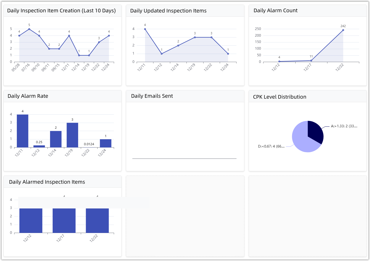
• Statistical Dashboard: Provides data summaries for management, intuitively displaying daily alarm rates, number of updated detection items, and anomaly lists, identifying systemic quality risks from a global perspective.
3. Closed-loop alarm: From anomaly detection to improvement record
A robust backend monitoring service is the core of the system's proactive defense. Its key feature lies in the independent configuration of anomaly detection rules and alerting rules:
• Omnichannel reach: The backend monitors SPC anomaly detection and CPK/PPK process capability alerts in real time. Once a rule is triggered, the system can immediately push alarm information via email, WeChat Work, DingTalk, Lark, and MQTT interface.

• Closed-loop management: Personnel receiving alarms can directly register improvement measures in the system. This closed-loop model, from anomaly detection and message push to the recording of processing results, ensures that nursing measures are traceable and that the improvement process is clear and transparent.
4. In-depth technological development: AI empowerment and reliability assurance
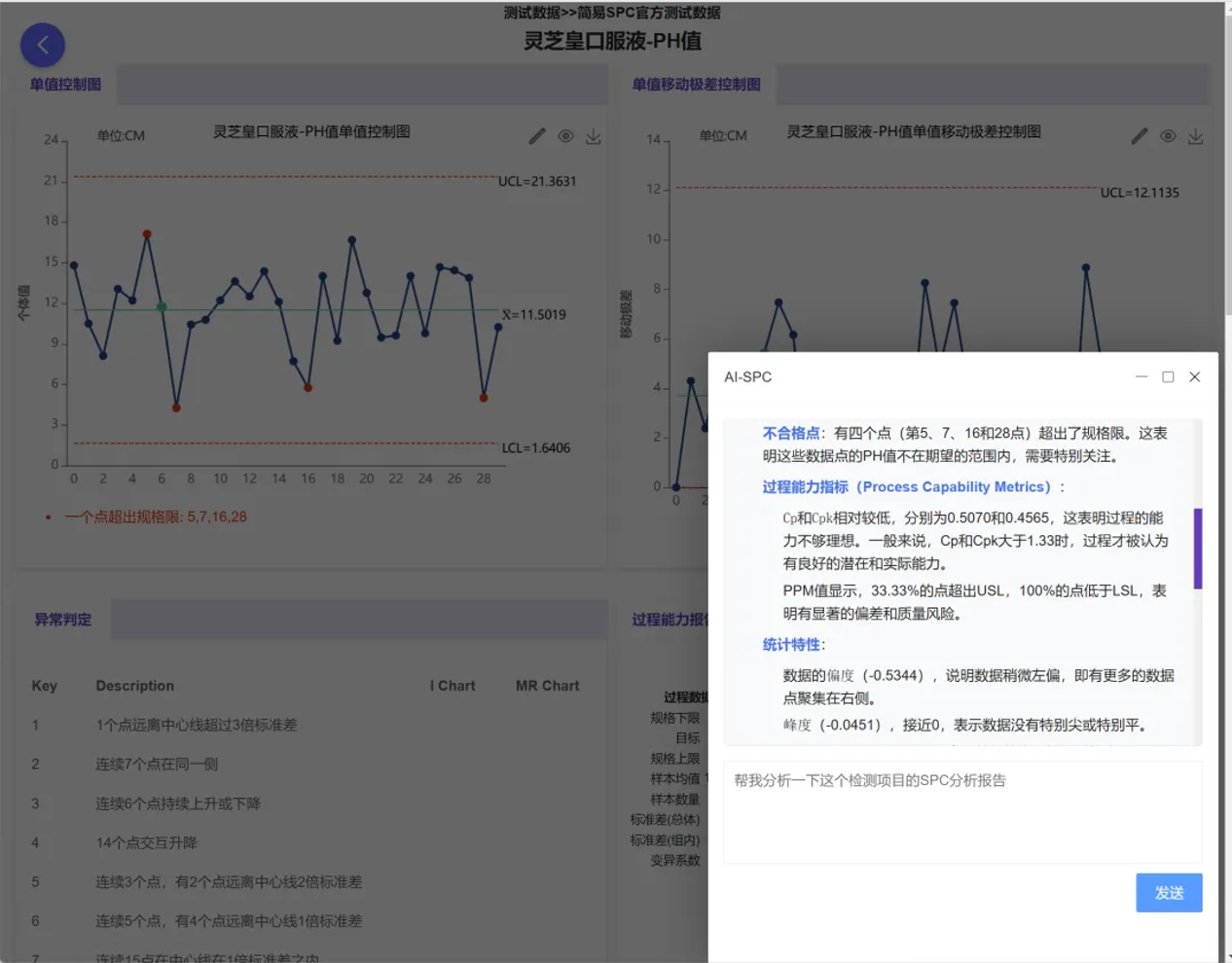
Beyond basic statistics, we've introduced more cutting-edge tools to deeply mine the value of data. The MSA (Measurement System Analysis) module covers gauge linearity and bias studies, Gage R&R studies, and more, ensuring the stability and accuracy of the gauges themselves before statistical analysis. Simultaneously, the system innovatively integrates large models such as ChatGPT and DeepSeek, enabling one-click intelligent interpretation of statistical results and assisting quality managers in quickly analyzing the causes of anomalies.
We are committed to helping enterprises build efficient digital quality systems with a lightweight architecture and extremely low technical barriers. By enabling data to "speak" and anomalies to be "detected in real time," we help China's manufacturing industry steadily move towards high-quality development.
- Simple SPC 4.0 – Detailed Product Overview
- Simple SPC 4.0 Official Release
- Using data to safeguard safety: Application practices of SPC in the pharmaceutical industry
- How can risks be identified in advance in automobile manufacturing? — Sharing SPC application practices
- Innovative Practices and Applications of Web SPC Systems
- Should Manufacturing Companies Still Implement SPC Amid Economic Downturn and Poor Business Performance?
- What should we do if the customer requires the immediate implementation of SPC process control during a factory audit?
- Simple SPC has been recognized for the third time as the "2025 SPC Statistical Process Control Software of the Year" by China SoftWare Home.
- Giving SPC AI Wings: DeepSeek Enhancing Efficiency and Depth of Quality Management
- AI-Enhanced Statistical Process Control (AI-SPC): Revolutionizing Quality Management in the Era of Smart Manufacturing
- General-Purpose Artificial Intelligence Models (DeepSeek, etc.) and Statistical Process Control (SPC): A New Era of Intelligent Quality Management
- Simple SPC 2.0 released, with upgraded functions and optimized performance
- CPK and PPK: Essential Questions in Quality Interviews, Do You Truly Understand Them?
- Unilateral or Bilateral: An In-Depth Exploration of Specification Limits and Control Limits in SPC Analysis and Their Impact on Metrics
- How to Calculate Control Limits for Xbar-R and Xbar-S Control Charts in SPC Analysis and When to Use Each Chart
- Is SPC or Another Method Better for Determining Batch Consistency with Standards? A Recommended Analysis Approach
- Beyond SPC Control Charts: Lesser-Known but Effective Quality Analysis Tools
- SPC is the most accessible, effective, and performance-demonstrating analytical tool in the manufacturing industry.
- How to Quickly Identify Hidden Correlations Between Test Items Using the SPC System?